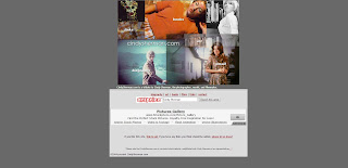
Cindy Sherman is one of the highest earning photographers - having one image in particular selling for $3.89 million. With this in mind, you'd have thought she'd have a gloriously professional website - but, in my opinion, this is not the case. The first result that comes up when you Google her name is this site - and she does not seem to have an official website (not one that I can find anyway) which is strange for such a popular practitioner. This is the website that most people would go to, looking for information and work, maybe thinking it's official, so I feel it still deserves to be critiqued (even though in reality, it's nothing to do with her).
The home page looks like this. I'm not too sure about the grey colour, and how it fits in with the colour scheme of the photographs and icons. However the main point of focus on the home page for me, is the whopping great advert at the bottom - advertising picture libraries and stock photographs. I know that in terms of the website this is probably needed, to generate money and whatnot, but it really puts me off and doesn't look professional. On a more positive note though, I like the collage of images above the advert, and how they make up the links to various places. This is quite clever and a bit different.
There is a lot of information on this website, as you can see. It's overwhelming and in no way makes me want to read it all - I could just go to Wikipedia and get a more concise low down. However scanning through the information, it all seems to be relevant. I think it's just the grey colour and the fact it fills up the whole screen that makes it unappealing. I think the general colour scheme of different shades of grey and maroon just isn't eye catching enough.
The last section displays her art (although as you can see from the home page there are also links to her films, books, other links and emails). This section is actually quite good in some ways. It displays some of her most popular photographs from different series', however not the whole series, and you would have time to look at everything. There are only 12 photographs to look at in total - which isn't really that great as a portfolio. When you click on the images, you also can't seem them any bigger and the quality isn't that great.
Viewing this website on a phone is much the same experience. All of the links work, and nothing is out of proportion - you just need to zoom in and out to view the images more easily, but that's not an inconvenience. The adverts are also still displayed - unfortunately!
Overall, I think that considering this website is not an official one, the makers have done a relatively good job. I'm guessing the site probably has a lot of views from people thinking it's real and wanting information - as I thought it was real at first before I checked the small print. However, I would say if the creators were going to review the website, they could maybe change the colour scheme and add a few more images.


No comments:
Post a Comment