Feb 27, 2013

Display books

I have always been more keen on display books, and after looking into portfolio and print boxes it has reaffirmed my initial feelings that having my portfolio in a book would be more suitable.

There are lots of places that sell portfolio books - and it's just a matter of looking around, in shops and online, to find out what you really really like. I'm yet to find my perfect portfolio but hopefully this research will give me a better idea of what I'm looking for.

High Street

I think shopping for a portfolio book in person is a much better experience, as you can physically hold the book before you agree to pay for it. You get to see exactly what size it is, what the paper is like, what colour is it etc, which you can't do when buying online. However, if you buy from a high street store online, sometimes they allow you to get it sent to the store, rather than to your home address, which could also be an advantage. WHSmith and Paperchase are the main two stationary/arty shops that I go in in Ipswich, so I thought I would see what they have to offer online (I am assuming that what is online is similar to what they have in the shops, or they can order in).

WHSmith

WHSmith have no portfolio books - at least none online. The only kind of portfolio storage they sell is these big carry cases, which don't look particularly nice and for me, aren't professional enough.


Paperchase

Paperchase offers slightly more portfolio related things. There are folders, books and files. However, the most impressive two I found on the website are the two most expensive (aka ridiculously overpriced). 


This folder looks clean and sturdy. It features inner pockets, a business card pocket, and it is also able to hold plastic wallets. I think if I managed to get some good quality plastic wallets, the combination of those and this folder would be a nice finished product. This portfolio case also comes with a shoulder strap and has a carry handle, so it's easy to transport, which is an important factor. However, as you can see, its £40, which to me seems far too expensive. I like it, but I don't like it that much. It would be £40, plus the cost of the plastic wallets, plus the cost of the prints - and that figure would be far too high.


The second portfolio that stood out is a display book (what is what I was looking for in the first place). The main feature of this book that I like is the leather cover, and the fact it has sheet protectors and paper inserts inside. Everything matches and looks sleek, and I wouldn't have to go and buy plastic wallets from another place. It's a shame this book is so expensive because I am really drawn to it - but it's just simply not in my budget.

Online


Silverprint also sells display books, as well as print and portfolio boxes.


Once again, I am drawn to the leather books. However, I think given the choice between buying from Silverprint and Paperchase, I would probably chose Silverprint - as they are more specific to the arts and understand what our needs are. These beautiful books however, range from £92.58 to £124.24, which is way, way too much money.


The Portfolio Store has the most options out of all of the above by a long way, however I have never heard of them before - it just came up when I Googled where I could buy portfolio books from. I think if I was going to pay a large amount for a book I would want to make sure the company was a decent one and/or get some recommendations. All of these display books seems reasonably professional looking.


This book is the cheapest, that I liked the look of. It's faux leather, available up to A2 size, and contains 20 fixed sleeves. I assume this means you can't add to it - but 20 (to me) seems enough. I think it looks quite elegant, and I could add personal touches as there is an inside pocket.


This is my favourite find - a leather portfolio that is available in 3 colours (which probably is only exciting me because every other portfolio is in black only). This display book is made from real leather, has a lovely little closer tab, it enables you to add and take away pages, can hold up to 20 sleeves, and is available up to A3 size. Even though this book doesn't go as big as the previous one, it still comes in the sort of size I'm looking for. The prices don't seem too bad either, if you take into account that it's real leather, and the folder from Paperchase was only a £1 cheaper. I am definitely bookmarking this page for future reference, and if you're wondering - I'd get the brown one.

Print boxes and portfolio boxes

The only portfolio I have ever had is an A4 sketchbook with prints stuck in with photo corners, so it will come as no surprise that I didn't know that print boxes or portfolio boxes existed - or that there was a difference between the two, so here's the low down.

Print boxes:
  • Budget priced.
  • Elegant, but relatively cheap.
  • For submitting and displaying work for clients/employers.
  • Two piece box.
  • Scratch resistant cover.
  • Can fit polyester sleeves.
  • Depth 1.5cm.
They also come in a range of different sizes, as follows:


Portfolio boxes:
  • Clamshell design.
  • Safe storage.
  • Opening into two trays for double presentation area.
  • Prints can be moved from one tray to the other, to minimise handling and damage.
  • Can fit polyester sleeves.
  • Made with archival boxboard.
  • Double thickness.
  • Comes in black.
  • Low sulphur content.
These come in a range of sizes and depths:


As you can see, portfolio boxes are more expensive, as they are meant to be more professional. I like the fact you get an option of different depths as well as different sizes. However, being a student I'm constantly having to think about cost above everything else, and how I can get the most out of my money. Is it worth paying more for a portfolio box when you can get a larger print box for the same price? I think if I was going to buy one of these right now it would be an 8x10 print box. At this size, it would be easy to make prints, easy to carry, but still be big enough to see the detail.
However saying that, I'm not particularly attracted to print boxes or portfolio boxes full stop. They don't seem personal enough to me, and they only come in one colour - just generally a bit boring. I would much rather have a folder or book, that I could design and add little touches to.

Feb 26, 2013

Building a portfolio

What is a portfolio?
1. A large, thin, flat case for loose sheets of paper such as drawings or maps.
2. A set of pieces of creative work collected by someone to display their skills, esp. to a potential employer.
A portfolio doesn't have to be your favourite work - it can be based on a series/theme/medium etc.

What is it for?
Before producing a portfolio, you have to think about its purpose, and how you can adapt it to fit in with where/why you're showing it. For example, a job interview would require a different portfolio to a gallery view.

Your Audience
You also have to consider the audience, and what reaction you want from your photographs. Some photographs may have more impact than others and this should be taken into account when doing the edit.

Paper vs Digital
The format your portfolio is in is one of the most important things to consider. Both paper and digital have their advantages and disadvantages. Being able to email your portfolio to clients is always a plus - as things are quick, and it gives them more time to look at it, whereas a paper portfolio presents more quality, and more physical aesthetic effort.

Style and Design
There are several kinds of folders and portfolio cases around, and I think it's just a matter of trying to find the one that you like the best, and that fits your style. You have to consider things such as size and paper quality, but moreso than that, make sure you add a personal touch to make it stand out from all the others. It needs to be memorable.

Theme
The theme, much like the format and style, would depend on your audience. Portraits, landscapes, shots taken with a specific camera, tasks, locations, black and white work etc. It's not best to mix these up, as the portfolio won't be as cohesive. Also make sure there is a consistant colour balance and quality throughout.

The Edit
The edit is usually the most difficult part, as you become attached to certain pictures. A way around this is to get someone else to help, as getting another opinion is always good - it would be impartial advice. It's good to get it down to (about) 20 or 30 shots, but less is more. Don't put filler photographs in so there's more stuff, just because you think it looks better.

Presentation
Consider how you could enhance your images through presentation. Think about if you want borders or not, the colour of the backing paper - general layout related things. You also have to consider what order the prints are gonna go in - this could be chronologically, or by something like subject matter.

Contents
A portfolio doesn't just have to contain pictures. Other things it may contain include:
  • An artistic statement.
  • A list of the shots you've included.
  • Titles of the work or descriptions.
  • Dates or locations.
  • A thumbnail sheet or contact sheet of all the photos contained.
Contextual information can sometimes be necessary, but keep it brief. The main focus still needs to be on the images.

Other points
To make setting up a portfolio easier it's important to be organised - files on the computer, contact sheets, negs, prints etc. Getting an experts opinion is also a good idea - I think we have the opportunity to get portfolio reviews from visiting practitioners at uni. You can also think about making your own book, as this is ultimate in unique, and there are several publishing companies out there. Once again, it's all about having a look around.

Feb 24, 2013

Paying for a website

This is a subject I have no clue about, as I've been using free templates and blogs since I first thought I needed a website. The advantages of creating your own website is that it can be different, and no-one will have the same design as you, however the disadvantage is you have to pay for it. The cost is what I have researched.

From what I can gather, there are three groups of things you should take into account when creating a website; the type of website you want, how much you're going to have to fork out and how you can make the most out of that.

The three types of website:


Brochure/static
This type of website generally only has a few pages and the content isn't updated very often. When changes need to be made to a brochure/static website then the owner has to contact the website designer.

Ecommerce
Similar to a static website - few pages and rarely updated, but has the addition of a shopping cart, so people can shop for the products you're selling. You can make changes to the shopping cart part yourself, however if changes to the main website need to be made you, once again, have to contact the website designer.

Content driven
For businesses that are solely based on the internet. Has more pages, lots of content, driven by a complex set of coding.  This can include links, pictures, videos, social networking elements (basically, all the fancy stuff).

Examples of what you will be paying for:

(all figures in italics are a rough estimate)
  • Registration of your domain name. £10-£20.
  • Hosting (basically renting a space on the internet). £2.50 per month.
  • The website designer. £250 a day, depending on how complicated the overall site is.
  • The development of the website (HTML coding). £300-£400 a day.
  • Copyrighting. Some companies chose to employ a copyrighter. £200-£300 a day.
  • Images. Stock images £2-£200 or using your own images.

How to make the most of your money:

  • Look at other professionals websites. See which website designer they have used and pick out features that you like. Don't copy them though. Remember you want your website to reflect your work and you as an artist - not someone else.
  • Gather lots of quotes, to make sure you go with the best designer that offers the best price for the work you want doing.
  • Draw up a timescale to keep yourself on track.
  • Look at design packages from website template sites, as one of these could offer you what you want and is less complicated than going through a designer.
  • Look at freelance designers as well as ones that work for companies.

Websites used for this research:

Free website templates

When you Google 'create a free website' so many options come up, so don't think the 3 I am comparing are the only ones out there. When creating a website it's important to look at several options, and base your final decision on what you like, and what is right for your work. 


Webs


Top on the list when I Googled 'create a free website'. Webs lists its main website features as:
  • Drag and drop sitebuilder.
  • Professionally designed templates.
  • A premium service that allows you to create a domain name.
  • Ecommerce - for selling your work.
  • Search Engine Optimization - your webpage will be higher when certain keywords and tags are searched for.
  • Adding photos, slideshows and videos.
  • Being able to create blogs and forums.
  • Putting social networking icons on your website.
  • Free mobile site.
  • Visitor stats.
  • WebsApps - you can download different apps to suit your specific needs.
  • Support portal if you have any questions.

Wix


With a very happy looking man it's homepage. First impressions of Wix were certainly better than Webs, as I just preferred the cleaner look of the homepage. Wix lists it's main features as follows:
  • Hundreds of beautiful designs.
  • Top industry hosting.
  • Drag and drop website builder.
  • 24/7 support centre.
  • Offers visitor stats and helps bring more visitors to your website from the search engines.
  • Wix app market.
  • The ability to set up an online store.
  • Links to social networking.
  • Wix learning centre if you get stuck.
  • The ability to have a personal domain name.
  • Mobile and fan page.
  • Amazing videos and galleries.
  • Premium account allows more storage and bandwidth.
  • Free content - such as fonts, music, pictures, menus.
  • The ability to hire a professional to help design your website.

Moonfruit


I seem to remember Moonfruit was a website template that my lecturer mentioned. Moonfruit lists its main features as:
  • Automatic mobile optimization. Your website will look the same no matter where you access it from.
  • Automatic link to Facebook with just a few clicks.
  • Enormous library of backgrounds, images, templates and animations.
  • Complete image control - layering, animating etc.
  • Premium service comes with Getty images.
  • The ability to set up an online shop, that automatically gets published to Facebook/eBay/Etsy.
  • The ability to set up a blog to bring more traffic to your website and shop.
  • Add content without coding.
  • Search engine friendly, automatically marking up all content so it's easy for search engines to read and understand.
  • Google Analytics - viewing stats.
  • Lots of package options if you want more than the free account can offer.

Comparison


From looking further into all of the websites, firstly I noticed that Webs is American (the domain prices are in dollars), whereas Wix and Moonfruit are both British (at least they offer to buy things in pound sterling). This means you would have to consider the exchange rate if you're going to buy domain packages from Webs. This is the sort of thing that would put me off automatically. The second thing that I noticed, is that all three have similar features. There isn't really one that stands out as offering more than the other, which is kind of unhelpful. Wix does say it offers you the opportunity to work with a professional web designer to create your page - however I am guessing you have to pay for this, and I don't necessarily think working with a web designer would give you any advantages. It's your website at the end of the day and it should be a product of your own creativity. I get the impression that Moonfruit is more helpful when it comes to setting up a shop, something I've never really thought about. If you were a graphic designer or independent artist, that is the sort of feature that would draw you in. Moonfruit also offers more packages than Wix and Webs, of many different price ranges. I personally don't know anyone who uses Webs, or Moonfruit, however I have heard a classmate mention Wix before. Recommendation and having a general nose around is a good thing too.

Feb 22, 2013

Modifications


After looking at websites of professionals, I have modified my own website a little bit, to make it more aesthetically pleasing and user friendly.


The first changes I have made are in the menu bar. 
Firstly I have added an about section. This is still under construction, as I plan on doing some more research into how much information is good information, and what sort of thing I should be writing to make it seem professional, but not too pretentious.
Secondly I have changed the amount of series' available to look through (although I am planning to add some more soon). My lecturer said a couple of weeks ago that it was better to have sets, instead of just random photographs, so I have taken that on board. There was a lot of pages within pages before, which I didn't really need. I think at first I thought I needed to put as much work out there as possible to make sure people could see I could do everything (!), but I have learnt that specialising is more important. Less is more, and all that jazz.

The last and the most important change I have made is when viewing the sets. Before these images were smaller, and you could not click on them and enlarge them. After looking at professional websites I have noticed that bigger images are better - as the person looking can see more detail, and it's a little bit more interactive. There is also a slideshow at the bottom - so you can select an image you want to see bigger from this screen, instead of closing and going back.

I'll probably change it again in a couple of weeks but for now, I think it looks alright!

Feb 19, 2013

Website critique 4 - Cindy Sherman


Cindy Sherman is one of the highest earning photographers - having one image in particular selling for $3.89 million. With this in mind, you'd have thought she'd have a gloriously professional website - but, in my opinion, this is not the case. The first result that comes up when you Google her name is this site - and she does not seem to have an official website (not one that I can find anyway) which is strange for such a popular practitioner. This is the website that most people would go to, looking for information and work, maybe thinking it's official, so I feel it still deserves to be critiqued (even though in reality, it's nothing to do with her).

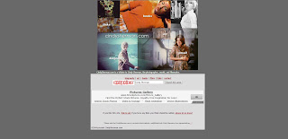
The home page looks like this. I'm not too sure about the grey colour, and how it fits in with the colour scheme of the  photographs and icons. However the main point of focus on the home page for me, is the whopping great advert at the bottom - advertising picture libraries and stock photographs. I know that in terms of the website this is probably needed, to generate money and whatnot, but it really puts me off and doesn't look professional. On a more positive note though, I like the collage of images above the advert, and how they make up the links to various places. This is quite clever and a bit different.


There is a lot of information on this website, as you can see. It's overwhelming and in no way makes me want to read it all - I could just go to Wikipedia and get a more concise low down. However scanning through the information, it all seems to be relevant. I think it's just the grey colour and the fact it fills up the whole screen that makes it unappealing. I think the general colour scheme of different shades of grey and maroon just isn't eye catching enough.


The last section displays her art (although as you can see from the home page there are also links to her films, books, other links and emails). This section is actually quite good in some ways. It displays some of her most popular photographs from different series', however not the whole series, and you would have time to look at everything. There are only 12 photographs to look at in total - which isn't really that great as a portfolio. When you click on the images, you also can't seem them any bigger and the quality isn't that great.

Viewing this website on a phone is much the same experience. All of the links work, and nothing is out of proportion - you just need to zoom in and out to view the images more easily, but that's not an inconvenience. The adverts are also still displayed - unfortunately!

Overall, I think that considering this website is not an official one, the makers have done a relatively good job. I'm guessing the site probably has a lot of views from people thinking it's real and wanting information - as I thought it was real at first before I checked the small print. However, I would say if the creators were going to review the website, they could maybe change the colour scheme and add a few more images.

Feb 16, 2013

Website critique 3 - Alec Soth


When you first find yourself on Alec Soth's website you are greeted with this massive bold text - a personal couple of sentences about the photographer. This is both a little humorous, and informative, and sets the tone for the rest of the website of one that's not too serious. I like the colour scheme - white, blue, grey and yellow. It's subtle, with splashes of colour here and there to make it interesting. I was also surprised to see that Alec Soth's website is powered by WordPress -  a free website template (although he obviously paid for the domain name). It's kind of nice to see that even though he's a very well known and respected practitioner, he hasn't used anything too fancy. It seems to me to be more about the work, rather than the website.


Accessing his work is very easy - just click on the projects link in the bar on the left hand side. This then expands to give you the names of various series' Soth has completed. After selecting which one you want to look at you are greeted with the above - the cover of the book, followed by a photograph of a gallery display, and then the photographs in the series. The scrolling is different from the two websites I have critiqued before, as there is no automatic slideshow. You have to scroll horizontally rather than vertically using the arrow keys. I think this is a good feature - making the most of the space on the page. The images are good quality and a good size. You can also click on individual images to see them on their own.


Even though there is a lot of information about Alec Soth in the CV section of his website it's very concise, and it doesn't feel like you're reading a lot. You can also see that Soth's work has been exhibited a LOT. There is a link to various press about Soth, so we can look at someone else's opinion if we want to, and there is a FAQ on his website - which is always handy. When viewing the website I had no problems with its speed and it's not confusing - far from it. I can't think of anything I would add or take away.

Viewing the website on a phone is much the same experience - although whatever device you're using will need to be held horizontally and zoomed out to the maximum, so that the images fit on the screen and flow more easily. The only trouble I had was if I wanted to click on a specific image to view it bigger. It got stuck, and I couldn't then exit this mode. I just ended up clicking all over the place to try and get rid of the extra window.

Overall, I think out of the three websites I've looked at so far, Alec Soth's has definitely been the best. The colours, the navigation, the images and the amount of information have all been what I would look for when visiting the website of a professional.

Website critique 2 - Martin Parr


The first thing I noticed about this website is the use of icons as navigation, instead of words. I think this suits Martin Parr, and it's different from any other website I have seen before - which I suppose is a good thing. It makes it memorable.


The only text used on the home page is the artist's name in the top left hand corner, which is strange of a photography website I think. Initially I thought I would have to guess what the icons stood for, but further investigation showed me that when you hover over them it tells you. I like this feature - it makes it a bit more interactive and fun.


There is a lot of information about Martin Parr on his website - I would say a little bit too much. When you click on the icon of his face you get to read an introduction about him, written by someone else. Five paragraphs of really arty farty words if you ask me - I don't think the website really needs it. Parr also has his CV on his website (the forth icon from the left) which when clicked gives us yet more information about him. However, I prefer reading this kind of information - as it's factual and gives us an insight as to why he started photography/where he's worked etc.


Finally the question mark icon represents an FAQ. In general I like FAQ sections of websites and Martin Parr's is no exception. It's quick access to questions you're trying to find out or questions you're interested in. Even though, once again, it's more information and words, I think it's a good feature. The white background and colour scheme is also kept throughout the website which I like.


Lastly the section about his work. The second icon from the left is a list of all the books and newspaper articles he has written, and books he has edited. Once again there is a lot of work under this category but the layout is good and consistent. It's easy to scroll around and have a general browse. Once you click on a particular book images let you have a look through it - at some of his past images. The camera icon in the navigation bar represents his recent work. I think it's a good move that Parr has chosen only a few series' to display, so you're not overwhelmed with photographs. A disadvantage of this section is that I think the photographs are too big. They overwhelm my browser window - which I'm not too keen on. Even though the photographs are on a continuous slideslow, you cannot advance with the arrow keys. You have to press the arrows to the left and the right of the image. I think being able to use the arrow keys would be a plus, just for convenience. 

In contrast to Stephen Gill's website, I actually preferred viewing Martin Parr's on my phone. The slideshow of pictures still works, but the images are much smaller and easier to view. I also think the icons look better on a phone - although if I hadn't of known beforehand what they stood for, it would've been slightly annoying - as it doesn't tell you what you've clicked on until you've clicked it. All the links in the navigation work, and it's obvious that this website has been optimised for devices other than laptops.

Overall, I think despite some small issues (which are probably just down to my personal taste) Martin Parr's website is effective, and being able to view it so easily on my phone is definitely a huge plus.

Feb 13, 2013

Website critique 1 - Stephen Gill


I really love the work of Stephen Gill so this is a website I find myself on quite often. 

I really like the simplicity - the background is white and the text is black. There aren't any distracting colours anywhere, so it is easier to concentrate on the work. Another feature I like is that it doesn't fill up all of the window until you get to viewing the pictures.


When you click on the 'portfolio' link on the left hand side this is what you are greeted with. I like how the website shows the name of the series along with a photograph from it - as sometimes I find myself knowing one and not the other, so that's a really helpful feature if you're particularly looking for something. It's easy to scroll through his work, using the 'previous screen' and 'next screen' buttons at the bottom. The only thing I would say is that he has done so much work it would take ages to look through it all. Maybe having a small selection would be better, and may encourage people to look at more series'. I also wouldn't have minded a small description about each of the series', as sometimes a bit of background information is needed so we understand why the artist chose to do what they did.

Once you have chosen which series to look at and have clicked on it, this is what comes up. The photographs in the series run on an automatic slideshow, but you can also move them along using the arrows at the bottom or clicking on a number. I like the automatic slideshow feature, but I think I would like to see pictures instead of numbers - so if I was looking for a particular picture I could find it quickly. The size and quality of the images are good, and navigation is good if you want to get back and view other pages.

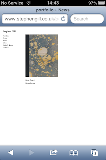
Viewing this website on a phone is a completely different experience. Because the size of the text and the website pages, you have to zoom in quite a lot to be able to read it and click on things. When loading the 'portfolio' page on my phone none of the series' showed up, and I was left looking at a blank page. The same happened after refreshing. I was therefore not able to look at any of his photographs on my phone - which is pretty rubbish if you ask me as it's probably the most important thing. All of the other links work.

Overall, I think if you are using a computer this website is successful, having a simple, easy to use design, and supplying all of the information you could want. However, it's a complete no go if you're using a phone.

Feb 12, 2013

Placement task - commercial photography

Our group was assigned commercial photography to investigate.

What classes you as a commercial photographer?

Money is paid for the subject of the photograph or the photograph itself. Organisations with a specific budget may employ a photographer, however other options are competitions and looking through stock libraries. An example of a competition that I've noticed is ITV Anglia's, where they ask viewers to send their pictures in of the weather. Commercial photographers usually work to a time scale and brief. The photographers will then be used for the purpose stated in the brief. Commercial photography is different from art photography in this respect - as artists make work that they want to, rather than working to a brief. Commercial photography make take influence from modern art, as well as popular culture. This could also be seen as a collaboration between the image maker and the company/person setting the brief - combining business and creativity. An example of a commercial photographer is Nadav Kander - who worked with Take That on their album Progress. 

How to become a commercial photographer

Steve's Digicams runs through what you need to become a commercial photographer and the steps you should take to help you get into the industry. It however does say that you need a degree to become a commercial photographer - which is not necessarily the case. Keith Cooper also discusses how to become a commercial photographer - and how to market yourself as a business as well as an individual. Even though some commercial photographers are employed by businesses, others choose to be self employed, which requires a different set of skills, outlined here by Focused Exposure.

Agencies

Photographers can sign up with agencies and get a recruitment consultant, who will inform you when jobs come in that they think are suitable for you. There are recruitment agencies specific for photographers, or just general. Some examples are Ipswich Recruitment AgencyForm Creative Recruitment and Impact. The Guardian also has a page dedicated to photography jobs throughout the industry.

University Campus Suffolk also has a PDF document on looking for work once we have left.

Placement task

This year we are expected undertake a work placement in the summer. We were put into 6 groups to research different areas that we could go into:

1. The Arts.
2. Education.
3. Publishing.
4. Commercial photography.
5. Photo labs.
6. Non-photographic.

Here are some important things I picked up from each groups research, and also a more in depth section about our group who researched commercial photography - which will have to go in a different blog post as this one is getting a bit long.

The Arts:

Creative Choices is a website dedicated to helping creative people find jobs and also gives some advice on what to do if you've just graduated and really want to become an artist earning money from your work. The Arts Council also helps develop art projects and creative ideas, as well as supplying the grant for the arts - which we found out about last year. I have also added the Artquest website myself, as we had a talk last year about it, and they seemed really helpful people - supplying us with information about jobs, new projects, galleries, answering FAQs about the art scene etc. It was also highlighted how broad the arts are. Tom made a very useful spider diagram showing all the different kind of jobs and what categories they fall into - such as physical (performance, dance), visual (photography, drawing) and aural (music, opera) - although some of these areas obviously overlap.

Education:

Jobs.ac.uk provides information about how to become a university lecturer and what is required. To study an MA (which is needed to become a university lecturer) you will need at least a 2:2 at degree level or a 2:1 - depending on the university. An MA usually takes 1 year full time and 2 years part time, and isn't funded. Gov.uk provides information about how to get funding for postgraduate study. All teaching qualifications now need a PCGE, which are available to do straight after your degree at some universities (UCS offers them). You can apply for funding to do this whilst studying for your degree. To get a job as a teacher you'll also need to have achieved QTS (Qualified Teacher Status).

Publishing:

This massive long list compiled by the University of Kent puts together a list of all the jobs you could work in if you wanted to go into publishing, and the requirements of each job. Jobs specific to photography could include a press photographer, a publisher (and getting your own photographic work published) and being a photo editor - for newspapers, magazines, websites etc etc. It was also mentioned in our lecture that people are employed to find images for companies and articles. This would involve looking through stock libraries.

Photo Labs:

The main photographic lab that we all know about is Metro Imaging based in London. Jobs in/involving photographic labs are ones such as a forensic photographer, lab manager, processing machine operator, photographic process worker, film processing technician, a printer, a scanner and a lab assistant. The College Grad website provides information about where different lab jobs are if you're interested in working in that area (although they all seem to be in America? I'm not sure if this website is specific to America).

Non-photographic:

This section is so broad, it could mean anything - from working at Tesco to being a football player. However having a photography degree could help in the following jobs - even though they are not directly associated with the photography industry. Becoming a writer. You do not necessarily need a creative writing degree or any degree at all to become a writer, and it's a good way of earning money. Our lecturer said he used to write reviews before becoming a lecturer for a bit of extra cash. Cinematography is something that is very closely linked to photography. Directors of photography are always listed in the credits of films and television programmes. Some current vacancies can be seen here. Other jobs outside of photography are art directors, curators, illustrators and (completely out of our comfort zone) jobs in science!

Feb 8, 2013

Okay so I thought I would start off this blog by introducing myself!

My name is Scarlett, and I'm a second year photography student studying at University Campus Suffolk in Ipswich. I am most passionate about film photography, concentrating on landscape and street work, however I am also heavily influenced by Expressionism and Surrealist art. 
I have just finished my first second year university module entitled Constructing Narratives, and I'm now working on the second module - Situated Practice.
The only personal work I am really concentrating on at the moment is my ongoing series Photos Are Memories (developed from a first year university module).

To see any of the work I have mentioned above you can go to these places:

My webpage/university journey blog: http://srichesphotography.weebly.com

My blog: http://srichesphotography.tumblr.com

My Facebook: http://www.facebook.com/srichesphotography

Thank you for reading!